
Landing Pages: What to Put on One to Make It Work
 Grace Wilson
10 min read
Grace Wilson
10 min read
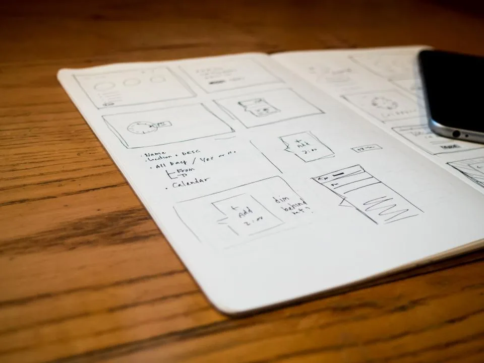
A landing page is not a home page with less on it
The most common failure we are asked to fix is not a page that looks wrong. It is a page asking for three things at once — read this, download that, book a call — and achieving none of them. Teams tend to build landing pages by deleting sections from the main site until it feels focused, and deletion is not design. What remains usually still describes the company rather than the reader’s problem.

A landing page has one job: move a specific person, arriving from a specific place, to a specific next step. Everything on it either supports that action or works against it. The word doing the heavy lifting there is specific. A page serving a cold visitor from a search result, a warm lead from a sales email and an existing customer from a footer link cannot be tuned to all three, and pretending otherwise is the origin of most of the pages we end up rewriting.
That is a scoping decision rather than a creative one. At SmartEdge IT Solutions we agree in writing who the page is for, where the traffic comes from, and what the single action is before any layout work starts, because the traffic source dictates nearly every choice that follows.
Pick the single action first
Before a heading exists, answer one question: what should a visitor do, and what do they get in return? Not what the options are — the actual one.

The insistence on a single action comes down to attention. Every additional option divides a reader who has already decided to spend about fifteen seconds. Two equally weighted buttons perform worse than one clear button with the other demoted to a text link further down. It feels worse to the designer and better to the business, and your own site will demonstrate it if the test is run properly.
Action types have different requirements, and matching the page to the action is most of the work.
- A form submission for a free assessment, quote or demo. Needs reassurance about what happens after the click: who contacts them, how quickly, and what they will be asked.
- A booking link to a calendar. Removes a decision entirely, which is why it converts well, and raises the quality bar, because a self-booked slot with no qualification fills with people who are not buyers.
- A phone number, for urgent or high-value enquiries. Visible above the fold, real text rather than an image, and usable as a tap target on mobile.
- A purchase, for anything you can sell directly. The page then carries payment, delivery and returns information as well as persuasion.
- A download, for gated assets. Works best when the asset is genuinely useful on its own rather than being a brochure with a form in front of it.
Write the action down as one sentence with a named outcome. The visitor submits their name and work email, and receives a written summary of what we found on their public website within two working days. If that sentence cannot be written, the page is not ready to be designed.
The message, and the proof that has to travel with it
Three components earn their place in the first screen, and they are not interchangeable.
What this is, in language a person outside your sector would use. Most headlines written for a technical audience fail because they address a buyer who already understands the problem, which excludes everyone in the market who does not yet know they have it. A useful test is to read the headline to someone who has never heard of your category and ask them what it means.
Who it is for, stated as a situation rather than a job title. Operations teams at manufacturers with fifty to two hundred staff tells a reader whether they are being sold to. It also filters, which is useful, though filtering only pays if the people you exclude were never going to buy.
What changes for the reader, concretely and inside a timeframe you can defend. Vague outcomes are the standard failure here. Specific ones survive contact with a procurement conversation, which is where they will be tested.
Proof has to sit next to the claim it supports rather than collected in a strip further down. What counts as proof depends on what you are asking to be believed. A named reference with a described problem and a described result is strong; a logo wall is decoration. Numbers you can substantiate beat adjectives. Screenshots of the actual product beat renderings. Where a claim cannot be evidenced, remove it — an unsupported superlative is a liability in a tender rather than an asset.
We treat this as the part most likely to be challenged later, which is why it is built from the client’s own material rather than generated first and approved afterwards. Proof nobody can defend in a sales meeting is worse than no proof at all.
The first screen has to work on a phone
Most landing page traffic is mobile, and most landing pages are reviewed on a laptop by people who will never see what the visitor sees. Check the first screen at a small viewport before anything else: what sits above the fold, whether the headline wraps into five lines and pushes the action out of sight, and whether an image competes with the text for attention.

Concretely, that means a headline that survives wrapping, a supporting line that fits, one visible action, and nothing heavy above the fold. Lazy-load anything below it. If the hero is a large photograph, give it width and height attributes so the page does not jump when the image arrives, because layout shift on the first screen is one of the fastest ways to lose someone who was in a hurry.
Tap targets need to be finger-sized. Form fields need the right input type so a phone offers a numeric keypad where one is relevant. The action must not sit inside a container that requires a pinch to reach. Small things individually, and together the difference between a page that gets read and one that gets scrolled past.
Our mobile interface design work usually starts from screenshots taken on real devices rather than from a desktop layout scaled down, because a compressed layout is not the same artefact as one designed for a phone.
The form is where most of the loss happens
Every field on a form costs conversions, and not linearly. A name, an email address and a way to reply are almost always enough to begin a useful conversation. Everything past that is a request for information you could obtain later from someone who has already shown intent by submitting.
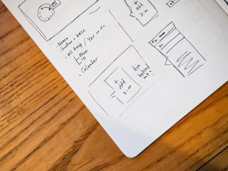
Remove fields you can get afterwards: company, job title, phone number, industry, company size. Ask only for what changes what you do next. If a field is genuinely needed to qualify — contract size, current system — put it in as a two-option choice rather than a text box, and consider asking it after the first conversation instead.
The small failure modes then cost more than the field count ever would:
- A label above the field rather than a placeholder inside it. Placeholders vanish the moment someone types and are not exposed to assistive technology as accessible names.
- A primary button that says what happens next instead of the word submit.
- A visible confirmation state. People submit twice when nothing appears to happen, and the duplicates contaminate reporting for months afterwards.
- An error message beside the field that says what to change, and that preserves everything already typed.
- A note on what happens to the details collected. Where a form takes personal data, the notice must say enough to meet the obligations that apply to you; this is legal copy, drafted with your adviser rather than copied from another site.
Automated tests catch broken cases and not hesitation, so the flow gets run by hand on a real phone before release. The QA practice we apply at SmartEdge IT Solutions treats form submission as the one path tested on every supported browser, because it is the only element whose failure costs you the enquiry itself.
Answering the objection that stops the click
Every page has a reason visitors leave early, and on a business enquiry it is almost never the design. It is one of four doubts: this will take too long, this will cost too much, this will not work with what we already have, or I do not believe you can do it.
Each has a section that resolves it, and each is worth writing before the page is designed rather than inventing under deadline pressure.
- Time: what actually happens after submission, hour by hour. Be specific about who does what and when they hear back. A named person who replies is more persuasive than a promise of speed.
- Cost: what the first engagement costs and what varies afterwards. Figures that will not be published still need describing, otherwise the reader assumes the worst number they can imagine. If there is a range, give the range and say what moves it.
- Compatibility: name the systems you integrate with, and be honest about the ones you cannot. We have no integration with your existing timesheet system, and here is what we would do instead, wins more credibility than silence.
- Ability: evidence relevant to the specific claim. A general portfolio is weaker than one piece of work that resembles the reader’s situation.
Put these near the action rather than in a footer. The objection forms as the reader reaches the button, not while they are reading the top of the page.
What to leave off
Some things appear on landing pages so often that their absence looks like a mistake. Consider omitting them deliberately.

- The full navigation. A conventional menu lets a visitor leave, and on a page built around one action that is a real cost. Keep the logo, one contact route, and a link back to the main site if the brand needs one.
- Unrelated content. Recent blog posts, a press section, a careers page. None of it helps this person decide.
- Stock photography of people pointing at screens. It carries no information and, for pages aimed at a technical audience, actively costs credibility.
- Testimonials with no context. A quote praising speed tells you nothing about whether the project finished on time. Ask for specifics or leave it out.
- Countdown timers and manufactured urgency. Fake scarcity is easy to spot and expensive to be caught on.
- Cookie banners and chat widgets stacked over the action. Both should wait until after the form is submitted.
The discipline is to justify every block on the page in a single sentence and delete the ones you cannot. A page cut back hard often reads as confident, because it looks as though somebody made choices.
Measuring it, and agreeing the scope in writing
A landing page only earns a second version if the first was measured. Before the build, agree numerically what success means and which actions count. More form submissions is a starting point; the more useful version separates submissions that become conversations from submissions nobody answered, because pushing volume into an unanswered inbox teaches you nothing except how to generate leads you cannot close.

Instrument it properly. Record the source of the session so paid traffic can be compared against organic separately, because they behave differently and a blended rate hides both. Where consent allows, send conversions back to the advertising platform as offline events — usually the most valuable tracking task in the account, and one that needs a defined field in the CRM rather than a spreadsheet. That plumbing belongs with CRM development, not with the page, and SmartEdge IT Solutions would scope it as a separate piece of work rather than hiding it inside a landing page build.
Test one variable at a time, and agree in advance what result would make you stop. A test with no stated stopping rule runs forever, and eventually someone reads it as a reason to rebuild the page.
Then write down what is excluded: additional pages, translation, split testing, copy for the thank-you page, ongoing conversion work. Landing pages are cheap to build and expensive to change once traffic depends on them, so the handover matters as much as the launch. Our landing page design engagements end with the files, the measurement plan and the list of things nobody agreed to do — because those unagreed items are what reappear as requests in month three.