
MOBILE UI/UX DESIGN
Beautiful, User-Centric Mobile App Designs That Drive Engagement
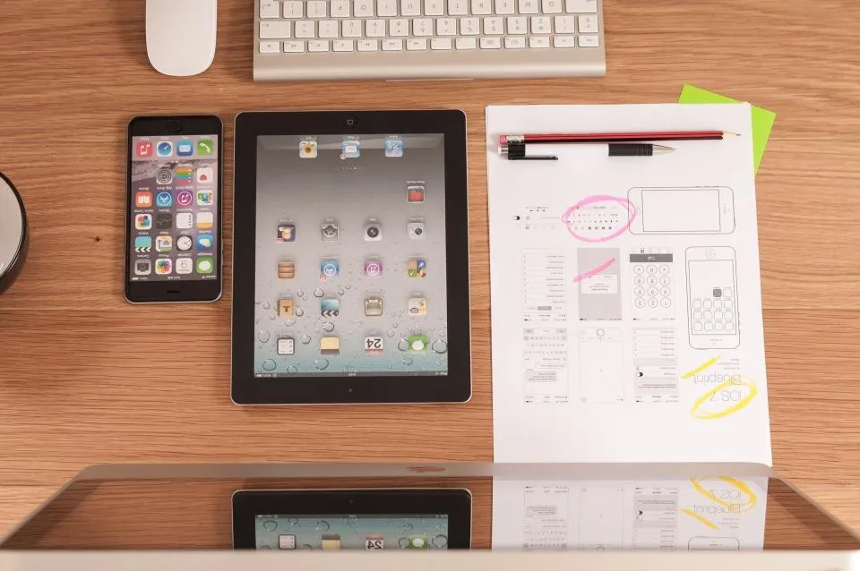
SmartEdge IT Solutions designs mobile interfaces around the tasks users need to complete rather than treating each screen as an isolated visual. The process can include user flows, information architecture, wireframes, interaction patterns, visual design, reusable components and responsive behavior across different device sizes.
Overview
SmartEdge IT Solutions designs mobile interfaces around the tasks users need to complete rather than treating each screen as an isolated visual. The process can include user flows, information architecture, wireframes, interaction patterns, visual design, reusable components and responsive behavior across different device sizes. We consider navigation, touch targets, forms, empty states, errors, loading states and accessibility so the interface remains useful beyond the ideal demonstration path. Design systems can also be prepared so that additional screens and future features maintain a consistent visual language.
USER JOURNEY
The path a person takes through a mobile app
- Open What the first screen should be, and what it shows when there is nothing to display yet, decided before the visual design starts.
- Orient The person needs to know where they are and what the app can do, using the navigation they already expect on the platform.
- Act The primary task is designed for one-handed reach and a real thumb, not scaled down from a desktop layout.
- Confirm The outcome is confirmed clearly, so the person knows the action took effect before they do anything else.
- Recover Failure states are designed with the same care as the success path: no connection, expired session, rejected payment and a rejected upload each get a defined response.
- Return Returning to the app resumes rather than restarts, so the person is returned to what they were doing.
WIREFRAME TO UI
Structure first, then appearance
Mobile interfaces are particularly unforgiving: a small screen, a thumb, occasional connectivity and very little tolerance for being made to think. Getting the structure right on a wireframe first is what makes the finished interface feel obvious to use rather than merely attractive.
- Wireframe Structure and flow, reviewed by everyone without the distraction of colour.
- Prototype Interaction tested where timing and gestures are unclear.
- Visual design Interface design at real device sizes, with states included.
- Component library Reusable pieces so the build and every later screen stay consistent.
- Handoff Annotated files and specifications, plus support during development.
MOBILE DESIGN SYSTEM
The components a mobile app needs
This is the inventory a build team needs, and the list that stops each new screen being designed from scratch.
-
Navigation
Tab bar, navigation bar, back behaviour and deep-link entry points.
-
Inputs
Text fields, pickers, toggles, date and number entry, all sized for touch.
-
Content
List rows, cards, headers, media, avatars and empty states.
-
Feedback
Toasts, sheets, dialogs, progress and error messaging with consistent behaviour.
-
Tokens
Type scale, spacing, colour with accessible pairings, radius and elevation.
-
Motion
Transitions and feedback that explain what changed, respecting reduced-motion settings.
DESIGN PROCESS
How a mobile design project runs
- Understand We meet the users and watch them use the current product or competitor apps, then record where they hesitate. You receive a written summary of what we observed, so the design responds to observed behaviour.
- Flow and structure We map the flows and the information structure for the small screen specifically, including thumb reach and one-handed use. You receive the flows and the structure before visual design starts.
- Interface design We design the interface at real device sizes with real content, covering the states that are usually missed. You review it in a working prototype rather than a static screen.
- Prototype and test We build an interactive prototype and test it with users, watching where they tap the wrong thing. You receive the findings and the changes made as a result.
- Systemise We turn the approved screens into a system your team can extend, with components, states and guidelines. You receive the system and the specification the build will follow.
RELATED SERVICES
Elsewhere in Mobile App Development
These sit alongside Mobile UI/UX Design and cover different ground. Each has its own page if the scope turns out to be broader than this one.
TYPICAL BUSINESS CONTEXTS
Where this service is usually needed
- An app whose interface has grown without a system
- A new app where the design should be right before development starts
- An interface that works on a phone but not on a tablet
- Improving engagement by redesigning a specific flow
- Preparing a design system so a team can build consistently
COMMON QUESTIONS
Questions about this service
It helps but is not required. Platform conventions matter — navigation patterns, gestures, back behaviour and system integration all differ — so we will design for the platform you are targeting, or deliberately for both where the product is cross-platform. SmartEdge IT Solutions treats that as a real constraint on mobile UI/UX design, not a formality, because the platform decides what a flow has to do. The core flow and structure work is largely platform-independent.
The shared set of components, tokens and rules that keeps an app looking like itself: type scale, spacing, colour, buttons, fields, navigation, list rows, empty states and the interaction patterns that go with them. It matters more on mobile than on the web because the same patterns appear on every screen and a small inconsistency is very visible at phone size.
Because they are most of what a user sees when something is not working, and because they are where apps most often feel unfinished. An empty list, a failed request, a permission denial and a slow connection all need a designed response that tells the person what happened and what they can do next. Designing them is not polish. SmartEdge IT Solutions includes them in mobile UI/UX design by default, because it is the difference between a usable app and a frustrating one.
Yes, and it is often the right approach. A specific flow causing most of the difficulty can be redesigned on its own, delivered in a release, and evaluated against the existing one. We would define the success criteria with you before starting, because without them it is difficult to know whether the change helped.
Yes, and it usually changes more than anyone expects. A short conversation with people who perform the process reveals the workarounds they have invented, the terms they genuinely use, and the cases nobody thought to mention in the brief. SmartEdge IT Solutions asks for access to two kinds of user: the confident frequent one and the reluctant occasional one, because they fail in completely different ways. Where support tickets or analytics already exist we start from those, which keeps the research tied to something real.
Screen designs with the states resolved, not only the happy path. Alongside those you get the flows, a component and token specification developers can work from directly, a prototype that behaves like the real product, and written notes on the interactions that are easy to get wrong. We keep those artefacts in a form your team can still use after the project ends. SmartEdge IT Solutions delivers design as a working specification rather than a folder of pictures, and it is part of how we run projects end to end.
Dark mode is not an inversion filter applied at the end. Colours, contrast, elevation and imagery all need deciding again, and a design that only works on a light background will produce something unpleasant on a dark one. We define semantic colours first and let the themes follow, which keeps both consistent and avoids maintaining two visual systems. Smaller screens get the same attention, since one-handed reach, larger touch targets and shorter lines often produce a better layout than simply scaling a design down.
For anything with real uncertainty, yes, because it is much cheaper than discovering the problem after development has started. A clickable prototype lets us watch somebody attempt the flow, which surfaces unclear steps, missing information and wrong assumptions faster than any discussion about it. It does not validate the technical approach and it cannot test performance, so we keep its scope honest. Findings from a short round of sessions go straight back into the design rather than into a report.
LET'S BUILD TOGETHER
Ready to Build Something That Actually Works?
Tell us what you are trying to achieve. We will help you work out the right approach, the right technology and a realistic plan to get there.